Next-Generation UX: What Should Be Considered in Terms of Successful UI/UX


Preface
What is common among successful user experiences?
We often think of 'simplicity, trendiness, user needs analysis' when answering this question. Anyone who has written UX strategy documents would think of those three almost automatically.
However, having these factors does not create a UX that people call as being 'innovative' or 'successful.' Most people like 'simple,' 'trendy,' and 'what I want (needs),' but on the other hand, many people prefer informative or conventional more than simple. Also, people these days want new experiences that go beyond their needs.
As such, people’s needs are becoming more diversified, making UXers deeply concerned. I was looking into the upper tiers of UX in and out of the country with this concern and found something very interesting. It was that they don’t always have those general characteristics that are so-called 'success factors.' More precisely speaking, UX with innovations that shake the market and generate paradigms rather has characteristics that are exactly the opposite of those factors.
Then, we’d need to know what cases go against the aforementioned characteristics, and what success factors are applied commonly without exception. To do that, I’ve taken a look at typical successful companies that anyone can agree: Kakao, NAVER, Google, and Apple. I made hypotheses as the following to see specific differences between what is common, as mentioned above, and characteristics of the four companies.
(Hypothesis 1) Successful UX models are all simple
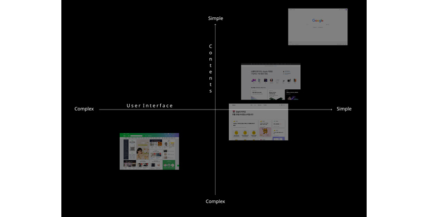 ▲ Starting from the left, the official homepages of NAVER, Kakao, Apple, and Google
Refutation
As shown in the above UX complexity map, companies leading UX trends are mostly located in the first quadrant, having simple content and UI structure. However, NAVER is exceptionally located in the third quadrant, providing the most complicated UX. So to speak, successful UX tends to be simple, but not inevitably so.
Innovative UX is mostly simple. But not all UX is like that. In particular, NAVER has various assets. It does not only have its established search engine, but also has Knowledge iN, email, news, economics, map, blog, life, dictionary, video, and comics, but continuously presents new services for daily life by connecting built-up assets and newly developed services, including its Webtoon AI Painter, NAVER WORKS, Clova, Cloud, VLIVE, Smart Block, and Zepeto. You may presume the properties of those assets led to a somewhat complicated UX/UI, right?
Insights
That is, you can peek into the mind of the company that, unlike other UXers, thought would be more efficient to allow users to utilize more information on one screen in consideration of the properties of their assets.
(Hypothesis 2) All successful UXers go for the trend
 ▲ From left to right, the initial UX of NAVER Knowledge iN, KakaoTalk, Google, and IOS
Refutation
They developed their own new UX, so you can’t say they pursue the trend.
Insights
Successful UXers rather make their new trends in their own style.
It was rather simple to verify this assumption. Because they all created “novelty” that was unprecedented. From NAVER Knowledge iN, KakaoTalk, and mac OS to Google’s Android OS and search engine, they all made their own new UX. Of course they were also susceptible to trends. They didn’t make something out of nothing without benchmarking or analyzing precedent. There was “dbdic,” where you can get comments from experts, that predated NAVER Knowledge iN, whereas KakaoTalk benchmarked the messaging app “WhatsApp.” There was “Yahoo” before Google, and iPhone was not the first smartphone. What is certain is that they all provided their own user experiences that went beyond the existing precedent. Trend analysis is a very important process, but this alone is not enough to stand out in the intense, competitive market. Pursuing trends makes you the follower, not the long-term leader.
(Hypothesis 3) All successful UXers focus on analyzing the users’ needs
-Steve Jobs
Refutation
Steven Jobs, the founder of Apple, said that 'a lot of times, people don’t know what they want until you show it to them.'
Insights
He provided the new experience system to the users with this credo.
Needless to say, analyzing user needs to plan the user experience is important. In fact, KakaoTalk has been improving their features and UX by constantly reflecting user opinions since the service was released, and is known to put great importance on the opinions of users and employees who work closely with the users when making decisions. Not only Kakao, but most companies are interested in the user needs. Steve Jobs did not say analyzing user needs is unimportant. What he meant was that the needs the users think they have may be restricted, so you shouldn’t be satisfied with them. It’s clear that if you don’t know the user needs, you’ll be ignored. Successful UXers had something extraordinary in common: They didn’t stay there. They all persisted on their credo and presented UX with their identities.
The above hypotheses tell us that the assumptions we initially made have exceptions to call it the law for success. Then, wouldn’t the common properties we found in the process be the common points for successful UX? I made the following new hypothesis to check.
(New hypothesis) All successful UXers would provide a user experience with their own 'philosophy'
Grounds
Four UX leaders thoroughly reflected their philosophies into the company assets and are building their UX accordingly.
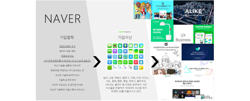 ▲NAVER created their new UX by connecting various assets in pursuit of 'culture of connection'
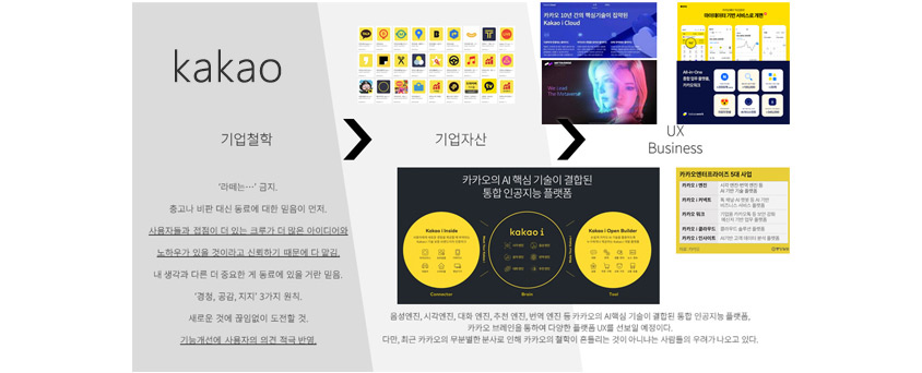 ▲ Kakao makes UX Business that actively reflects opinions from users and employees under the credo of 'mutual trust comes first over advice or judgment'
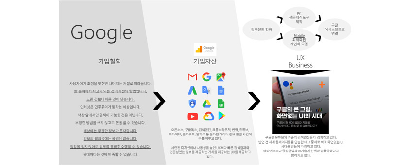 ▲ Google draws next-generation UX which is specialized in 'searching' as its main asset with the belief that 'selection and focus' are the best values
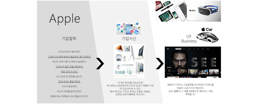 ▲ Apple leading the UX design in the IT industry, insisting on 'artistry and quality'
As shown in the above data, each of the four companies has their own philosophies and made different assets and UXes based on them. Moreover, it’s hard to find a company that lasts long without a philosophy of its own. However, we often fall into a mannerism where we only analyze results like UX instead of the basis, the 'philosophy.' That is why it’s easy to misunderstand that peripheral factors, such as 'simplicity' or 'trendiness' are what makes successful UX superficially. Nevertheless, we could see that the power of making user experiences that are loved over time in the ever-changing UX market today is their philosophy and credo.
Next-Generation UX?
If you have figured out the pattern of successful user experiences, now you can estimate what the next-generation UX would look like. Will the future UX be in 3D? Will it still be in 2D? It’d be more appropriate to expect it to be “for their own credos.” (In fact, Bloomberg estimated in 2022 that Apple would not blindly follow the trend and rather rule out the concept of a metaverse.) Especially since the pandemic, most companies have faced numerous variabilities, such as digital transformation, AI, the metaverse, and ESG, and the executives and UXers are in chaos. This is when the corporate philosophy on how to respond to the future becomes an important reference.
Epilogue
As a UX/UI planner, I would like to tell you that what’s important for successful UX is not following successful competitors and trends quickly and meeting what the users want. It may be a shortcut, but it doesn’t create a new road of your own. If you wish to make a successful UX that lasts long, first, you need to think dynamically and establish the philosophy and message that the company wants to put in from the perspective of a company as well as a UX planner. I hope such thoughts become one of the views that arouses the concerns of many UXers who create next-generation user experiences.
References
[1] https://themiilk.com/articles/a3502de7b
[2] https://zdnet.co.kr/view/?no=20220110105741
[3] https://www.techm.kr/news/articleView.html?idxno=71198
[4] https://biz.chosun.com/site/data/html_dir/2020/05/01/2020050100799.html
[5] https://www.edaily.co.kr/news/read?newsId=01600646599496776&mediaCodeNo=257
[6] https://www.adweek.com/sponsored/speak-up-and-prepare-yourself-for-screenless-search/
[7] https://dbr.donga.com/article/view/1202/article_no/10169/ac/magazine
[8] https://www.econovill.com/news/articleView.html?idxno=357149
[9] Quotations from Steve Jobs / Wirters’ / 2011
▶ The content is protected by the copyright law and the copyright belongs to the author.
▶ The content is prohibited to copy or quote without the author's permission.

Development Platform Group, Software Business Unit, S-Core Co., Ltd.
She is in charge of UX/UI optimization and planning at S-Core.