Preface
In the current UI design field, exclusive authoring tools, such as Sketch, Figma, and XD are popular rather than the existing Photoshop. I mainly use Sketch, sometimes XD. Sketch obviously has its advantages, but it is Mac-only which causes quite a lot of difficulties when working on Windows. However, Figma has been showing good performance recently, skyrocketing to be the most used tool in the UI design field. This article aims to help you choose the tool that fits the best in various situations by comparing Sketch and Figma. All UI designer should be familiar with Sketch, so I will focus on Figma's characteristics.
Authoring Tools Preferred by UI Designers
The core values of a UI design tool are platform diversity and functionality. The tools that work with both macOS and Windows are Adobe XD and Figma. XD was released about five years ago with a not-so-high market share. That is because it is the least functional among the three most used design authoring tools. It is also a reason why I use Sketch the most.
You can visit the 2021 Design Tools Survey (https://uxtools.co/survey-2021/#ui-design) for the result of the survey answered by working designers all around the world to find that the dynamics of UI design authoring tools which used to be represented by Sketch have changed a lot. That Figma was given the best assessment over all of the items while ranking number one in usage.
Although being the most-used does not necessarily mean it is the best product, it is one of the important factors for design tools since more users lead to more opinions which are reflected in updates, creating a positive feedback loop where it helps actual work.
Figma vs. Sketch
Let’s figure out Figma’s characteristics and advantages in comparison with Sketch.
1) Artboard vs. Frame
The concept of a group has been applied to design authoring tools from a long time ago for layers that are used a lot.
Since Sketch, the concept of an artboard in a project file was created to allow processing of many screens in one project and comparing more screens while working. Photoshop and XD followed to adapt the concept of artboard and designing UI in this way became commonplace.
On the other hand, Figma uses the concept of a frame instead of an artboard. Tools with artboards do not support artboards in the artboard function. But Figma, which adopted the concept of a frame, supports any number of frames in a frame. The frame can be an artboard, a component, or an image. You can think of it as a container. In addition, when you create a frame, the coordinates of objects placed within the frame are determined again based on the created frame. Contrary to the concept of a group, every frame has its own starting point (0,0). This is seen as a reflection of the concept of a programming language in the design work environment. You can think of it as similar to the HTML DIV tags.
 Comparison to the Structure of Sketch and Figma
In addition, Sketch is implemented in a way that the text box has the concept of container so that the content are obscured when the size of the box changes, while Figma's text box does not have the concept of a container, so the content is displayed as it is. In this case, you can create the same situation using frames.

 Example of using text box content
2) Resizing vs. Constraints
Resizing is the most efficient feature used in Sketch. It is an option that allows you to set the alignment or size in the internal space when creating components, making it easier to adjust the size of components you are using or respond when building a responsive layout.
In Figma, options are provided under the name of Constraints, which are basically similar to the features of Sketch. Designers who use Sketch will be able to adapt to Figma's Resizing easily.
 Resizing vs. Constraints
3) Smart Layout vs. Auto Layout
Sketch and Figma's layout automation features are implemented quite similarly, but Figma supports a little more detailed modification within the inspector area. The biggest difference between the two tools is that Sketch needs to be symbolized to use Smart Layout, but Figma does not need to be componentized to use Auto Layout for objects made of frames. Therefore, when it comes to automated layout features, Figma is configured more easily.
 Automated layout features in Sketch and Figma
4) Design System
The effect of design authoring tools is the key in bringing about innovation in the UI design work process. This is not simply because the tools have gotten better, but because the systems that use the tools have changed.
The existing design process was based on screen units, followed by design resources and design guides. However, with the advent of new tools, addressing the limitations and drawbacks of the existing work process led to improvements in the overall design process.
Design authoring tools, such as Sketch, XD, and Figma designed the work method to utilize the design system functionally for this improvement, and I think the design work process could be innovated by helping designers use them smoothly.
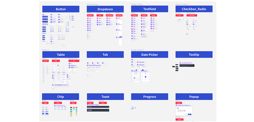
 Example of design system files
The UI design system changed its starting point to component units rather than the existing screen units and led the work order to recycle Assets called Symbols from Sketch and Component from XD and Figma. By building a design system in component units and recycling it to organize screens, the amount of design work was significantly reduced, and the uniformity of the overall design was established more clearly. Moreover, since this approach could increase the linkage with the development sector, synergy between design and development occurred, which had a positive effect on the entire process.
Since options within the tool for various settings, such as components, text styles, and color styles, are provided, Photoshop is no longer used in the UI design field.
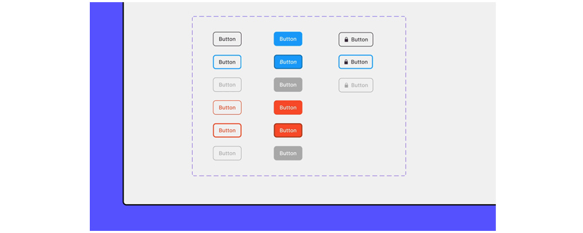
 Example of using Figma's library
Figma's design system is very similar to that of Sketch. It provides components, text styles, color styles, and more, and enables design system sharing among team members through the team library feature that is available as a paid service. Currently, the department I belong to loads and uses design system files through a shared server, so the concept is basically similar, but it is a shame that the work speed is slow.
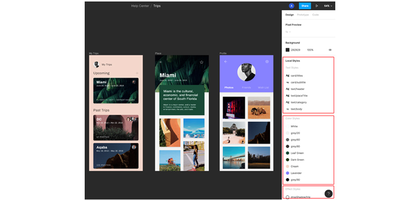
 Display of the style of Figma's text, color, and effects
One of the styling features of Figma that differs from Sketch is that effects (shadow, inner shadow, layer blur, and background blur) and layout (rows, columns, and grids) can be specified as styles.
5) Prototyping
I think one of the biggest differences between Sketch and Figma is prototyping.
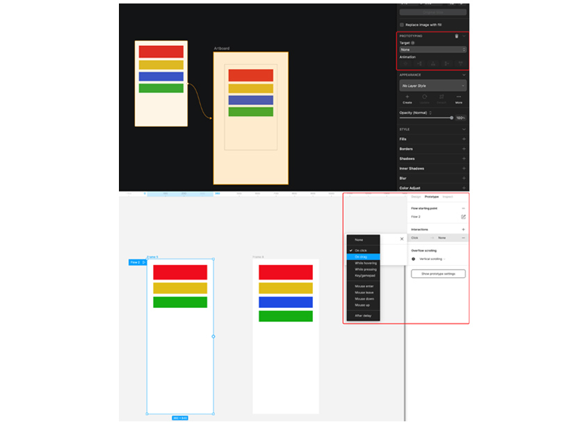
 The Prototyping setting screen of Sketch and Figma
The prototyping feature of Sketch is enough to produce results with a Lo-Fi quality equivalent to screen switching. Figma, on the other hand, can adjust various screen transitions (easing value can be modified) and even the interaction of frames, supporting to make results close to Hi-Fi quality.
* Note
Figma Prototyping Tutorial
Prototyping Tutorial
According to the 2021 Design Tools Survey (https://uxtools.co/survey-2021/#prototyping), the most used prototyping software as of 2021 is Figma, with an overwhelming number of users, beating prototyping-only tools. This is probably because Figma has solved the drawbacks, such as the inconvenience of converting the result after design work and the difficulty in usability. Prototyping-only tools have their own characteristics, and the resulting quality varies accordingly. However, Figma was chosen by many users because it can be connected naturally after design work while showing the result at an appropriate level.
Epilogue
So far, I have talked about Figma's characteristics.
The design department I belong to has built a design system with Sketch, and we are using it well to get high-quality results. However, since the environment where a Sketch can be used (Mac OS) is limited and many objects are included in one file due to the nature of the design system, the speed of file control is significantly reduced. Therefore, I have no choice but to think about the shortcomings and countermeasures of Sketch.
Since XD is a tool developed by Adobe, it has the advantage of moving naturally from the existing Photoshop, but it is difficult to select it readily because it is slow to update features and is inferior in usability compared to other tools at this point.
However, Figma began to surpass the functional advantages of Sketch from 2020, and as its advantages, such as versatility supporting both Mac OS and Windows and fast work speed, were recognized, a large number of users were introduced, and the gap is widening as feature updates were made quickly.
Of course, the tools we are using are not causing a big problem, but I think it is the right direction to understand the big trend well and be prepared to join the flow naturally whenever the situation changes. In addition, if the advantages of a tool can bring immediate improvement in the work process or physical and temporal benefits, it is necessary to consider changing the working environment, that is, replacing the tools.
References
[1] https://uxtools.co/survey-2021/#ui-design
[2] https://help.figma.com/hc/en-us
[3] https://www.sketch.com
▶ The content is protected by the copyright law and the copyright belongs to the author.
▶ The content is prohibited to copy or quote without the author's permission.

Software Business Division Development Platform Group of S-Core Co., Ltd.
He is in charge of UX design at S-Core.
